Art and Fear: Observations on the Perils (and Rewards) of Artmaking, by David Bayles and Ted Orland, is an inspirational read. The authors explore the mentality and obstacles of the ‘everyday artist’ and how they (or for the purposes of my writing, how I) can develop security in my abilities and produce work despite daunting obstacles. The straightforward approach to writing, matched with accurate descriptions, detailed analysis and the harsh truths of the art field, make these chapters a ‘must read’ for anyone with a keen interest in the arts.
First and foremost, I found this article to be thought provoking. It forced me to realize and analyze the insecurities of entering the professional art world, that I was previously unaware of. Along with realizing my uncertainties as an artist, I was also enlightened to the fact that I am not alone. This article focuses on the general misconceptions and thoughts that most artists wrestle with. One of the predominant issues I have struggled with, but put to rest after reading Art and Fear is that “art rests fundamentally upon talent, and that talent is a gift randomly built into some people and not into others.” The authors go on to describe that the main challenge in being an artist, or viewing yourself as one, is “the fear that fate is in your own hands, but that your hands are weak.”
One of the more uplifting views explored in this article is “the fact that most of us (including Ansel Adams himself!) had to work years to perfect our art.” Something about art has to do with overcoming things. I find comfort in knowing that I will gain the skills I need, and it is the process of gaining them, that is important. Making art is learned by making art. “To all viewers but yourself, what matters is the product: the finished artwork. To you, and you alone, what matters is the process: the experience of shaping that artwork.” There is little importance placed on perfect art, not at the beginning at least. The point is that we continue to create. Not all of our work will be appear finished or perfect, but by making art that we care about, we are nourishing the ‘artist’ inside of us. “Those close to you know that making the work is essential to your well being.” Art is personal.
Beyond making art that matters on a personal level, the next step is to set goals. The article addresses the issue that some artists strive so intensely for one thing, and only one thing, that once accomplished they have no other plan. “There is a painful irony to discovering how frequently and easily success transmutes into depression. Avoiding this fate has something to do with not letting your current goal become your only goal.” Personally, I have been exploring this issue for quite some time now. I have always placed importance on developing my talents in more areas than one. I have a keen interest in art, sure, but I also love literature and science, being outdoors and staying active. Further more, I have taken advice from my mentor, Freeman Patterson, to stimulate my brain in several ways. His example to me was that he is reading a book on Photography, as to stay connected to his field of work. However, he is also reading a book on Particle Physics, which he is also interested in. I am learning that by branching out, I am creating a safety net for myself when I come up a little short on ideas, or need a break. Setting more than one goal is crucial to remaining level as an artist.
On the subject of Physics, the authors described the materials an artist uses to be like particles, charged and ready for action, yet indecisive and unable to act on their own. “They do not listen in on your fantasies, do not get up and move in response to your idle wishes. The blunt truth is, they do precisely what your hands make them do.” Ultimately the artist is in control. What I do directly effects my art, and how my art turns out effects me in return. Making art takes time and patience and a considerable about of skill. What counts, is the relation to what is in your head and what happens as a result of your materials. The coloration between imagination and actuality determines the work. “What’s really needed is nothing more than a broad sense of what you are looking for, some strategy of how to find it, and an overriding willingness to embrace mistakes and surprises along the way.”
In sum, Art and Fear: Observations on the Perils (and Rewards) of Artmaking, helped me address the issues of misconceptions in art, my personal fears and the uncertainty that comes with being an artist. “In a general way, fears about yourself prevent you from doing your best work, while fears about your reception by others prevent you from doing your own work.” For most, it is an insecurity of feeling like you are only pretending to create art. This article cleared up several daunting issues and enlightened me to a world of interesting, thought provoking views. I am more confident in my abilities as Photographer, and now feel secure enough to call myself and artist. Knowing that others struggle with the same feelings about trying to make a living in the art world, is both reassuring and humbling.
Kim Vose Jones
“It’s beautiful,” I said, not knowing what I was looking at. Then it happened; that moment of realization. My brain quickly processed the visual information before me, and my expression became slightly less enthusiastic. This was my reaction to Kim Vose Jones’ exhibit, A Farewell to Flesh, at the Beaverbrook Art Gallery. At first glance it’s inviting, soft and comforting. Then you realize what you’re seeing, and the installation appears slightly less innocent and appealing. Going beyond the initial monotone color and touchable displays, it becomes apparent that the work represents the inner structures of the human anatomy. The artworks that first seemed to be abstract forms quickly portray themselves as sexual references.
The title itself represents the idea of digging into subject matter to fully explore content and meaning. ‘A Farewell to Flesh’ is a loose English translation of the Latin word ‘carnival,’ which means letting go, revealing or celebration. These terms directly represent the starting point of which the artist used to create the body of work. At her artist talk, Kim Vose Jones stated, “the work is about boundaries and the threshold that crosses between them. It’s about transitions, especially those often unexplored; transitions from life to death.” In this talk she addressed the issues of body and beauty and the abject state between two realms, between an object and a subject.
In listening to the artist, it became apparent that A Farewell to Flesh was largely about opposites. She addressed the contrast between bitter and sweet, life and death, pleasure and pain and the inside versus the outside. One of the most pertinent dichotomies was the contrast between male and female. The show displayed forms related to both male and female organs. Plastic and glass tubes flowed through several pieces of art, connecting the natural shapes with a synthetic product, alluding to topics such as artificial insemination, rebirth, and what we as humans do to our interiors. “My recent work explores the interdependence of body and mind by enlarging microscopic images from inside the human body at various stages of metamorphosis and change.” Overall, a specific question arose: how human are we anymore?
Her work at large includes biomorphic forms through which she explores subjects that are spent and decaying, all the while being sexual, spiritual and beautiful. One of the larger works comments on the idea that something looses purpose when not in it’s place. It hangs lifelessly from the ceiling, dropping in the centre. It seems tattered, almost resembling dried animal skins. It is seemingly old and useless. This specific work reveals the subject of something used and discarded, the remnants of what was once beautiful. This piece is also linked, in subject matter and material content, to many other pieces displayed in the gallery. The works speak to a certain level of creativity, growth and life cycle, all of which are processes that feed off each other.
Kim Vose Jones works with a variety of materials, making her art an interesting and unique presentation of work. Many of her pieces are large, felted objects but her materials are not restricted to such. Her work also includes the usage of wire, glass, plastic, ropes, mesh, and salt. In the examination of these materials another contrast appears: that of synthetic versus organic. Kim gathers inspiration from nature and the human body, so most of her work reflects upon organic shapes and figures; white blood cells for example. Her work is centered upon natural shapes, looks and senses. Some pieces appear delicate and refined, which are then contrasted with man made materials, demonstrating harsh, permanent and lasting effects. The art feeds off of existing information such as what the materials can do naturally.
Kim Vose Jones expressed her interest and attention to what the viewer brings to the installation. It is her opinion that the viewer becomes part of the art when interacting with it. “People bring their own experiences and ideas with them. It is their personal view that makes the sculpture happen.” In the same way, she concentrated on creating a multi-sensory exhibit. Playing with tactile art and the desire to touch or smell. Her materials complement this idea as the felted objects looks soft and inviting to the touch, while the usage of salt on the ground entertains the sense of smell.
There are no titles given to the individual pieces of art, as the artist feels that they were created as a group, are meant to be seen together and therefore wants the space to be viewed as a whole. The pieces contrast each other, yet are working together as a unit. The exhibit demonstrates a focus on space, both negative and positive. There are a variety of levels, heights and weights amongst the installation, even when examining the space inside each piece. To push this concept further, the simple use of only the color white emphasizes the line around each form all the while confusing the viewer as to what is that space and what is the object. The art also speaks to a level of liminal space: a place where boundaries begin to dissolve and we stand, on the threshold, preparing to move across the limits of what we were into what we are to be.
The art itself tells a story, but it is emphasized with the interpretation of each viewer and elongated by an explanation from the artist herself. Kim Vose Jones examines the literal and the abstract; giving a detailed analysis of the changes the human body encounters, mixed with the influence of modern living and the wear-and-tear each person endures. The exhibit at first appears to serve little purpose but to be visually pleasing, however with further examination and meditation it proves to be incredibly well defined and thought provoking.
NBCC Scholarship
NBCC Foundation
Beaverbrook Building
PO Box 6000
Fredericton, NB
E3B 5H1
October 4th, 2011
To the Board of the NBCC Foundation,
My name is Karina Kierstead and I am a second year student at the New Brunswick College of Craft and Design (NBCCD), in Fredericton. I am studying Photography as a part of NBCCD’s Diploma Program, as well as the Bachelor of Applied Arts Program with the University of New Brunswick. I am submitting this letter to be considered as a candidate for the Scholarship and Bursary program provided by the New Brunswick Community College Foundation.
I have chosen Photography as my field of study because I feel compelled to seek formal training in what has always, until now, been a hobby. I have always loved taking pictures and have even had employment experience in this field; I was hired by a local summer camp to be the head ‘Photo Capture’ position. Essentially, it was my duty to capture and catalogue photos and events throughout the summer, so they could be placed in promotional brochures.
Gaining an education in this field is critical to my growth and development as an artist. NBCCD is providing me with directed study and skills that will propel me forward in a competitive work environment. However, entering this field comes at a high cost. The equipment and software needed for my current program increases the more in depth my education becomes. The most essential piece of equipment for me to have is a Digital SLR Camera, which alone will cost between $800.00-$1000.00 (entry level). Some other basic pieces of equipment would be an additional lens ($200.00), off-camera flash ($600.00), tripod ($200.00) and Adobe Photoshop CS5 ($300.00 educational version). Acquiring this equipment will give me the tools needed to develop my skills in work related situations, as I could begin to establish a career for myself by seeking commissioned work. Having equipment, like a professional grade camera, readily available, will give me opportunity to practice and perfect my trade.
For several years I have committed my summers to full time employment in attempt to prepare myself financially for post-secondary education. In the summer of 2011, I was employed as a receptionist by Century 21 Real Estate Agency and as the Summer Coordinator for Kennebecasis Baptist Church. As Coordinator it was my job to develop and execute a children’s program that ran five days a week, for the duration of the summer, as well as plan additional events for the Middle School and High School youth. Further more, since beginning my studies at NBCCD I have held two part time jobs, throughout each academic year. I work as a Page at the Legislative Assembly of New Brunswick and as a part time childcare provider. Despite my efforts to maintain two part time jobs and participate actively in full time schooling, I still fall short of the necessary finances. Furthermore, due to new provincial budget cut backs and student loan regulations, the monetary sum provided by both the New Brunswick Student Loan and Canada Student Loan agencies does not even begin to cover the costs of one year of my five year college plan.
Beyond my duties as a full time student, I have maintained a high level of involvement in extra curricular activities. This year, I am a member of the Student Representative Counsel, which provides the student body with educational opportunities, interesting events and peer support. In the past, I have been heavily involved in community and school sports such as basketball and swimming. In high school I was elected swim team captain. Both in the past and present, I have life guarded in public and private settings. I have been involved with drama clubs, school band, yearbook committee and community volunteer work.
I am, and will forever be captivated by the intense beauty I see around me, both in people and the natural world. Not only do I embrace the opportunity to still time, but also select exactly the pieces of information I retain from the moments that pass. Photography is a chance to create my own world through the objects, people and surroundings I choose to enclose in every shot. To push myself further creatively I sought opportunity to be mentored in my field of study. As a result, I am working under the advisement of world renowned Photographer Freeman Patterson. This gives me the chance to meet with him regularly, have him critique my work and discuss practical ways to enrich my career in Photography.
In the future I intend to use the skills and techniques acquired in my time at the New Brunswick College of Craft and Design to make a career in Natural Photography. I would like to work for a publishing firm as a magazine photographer, namely National Geographic. There are several other careers paths that I could and may eventually pursue. All in all, as long as I am able to translate my passion for photography into an employment position in which I can support myself, I will be content. Any financial assistance that the NBCC Foundation can supply me with will be of great use to propel me forward in my educational and career plans.
Thank you for your consideration,
Karina Kierstead
811 Charlotte Street
PO Box 6
Fredericton, NB
E3B 1M7
Semiotic Evaluation


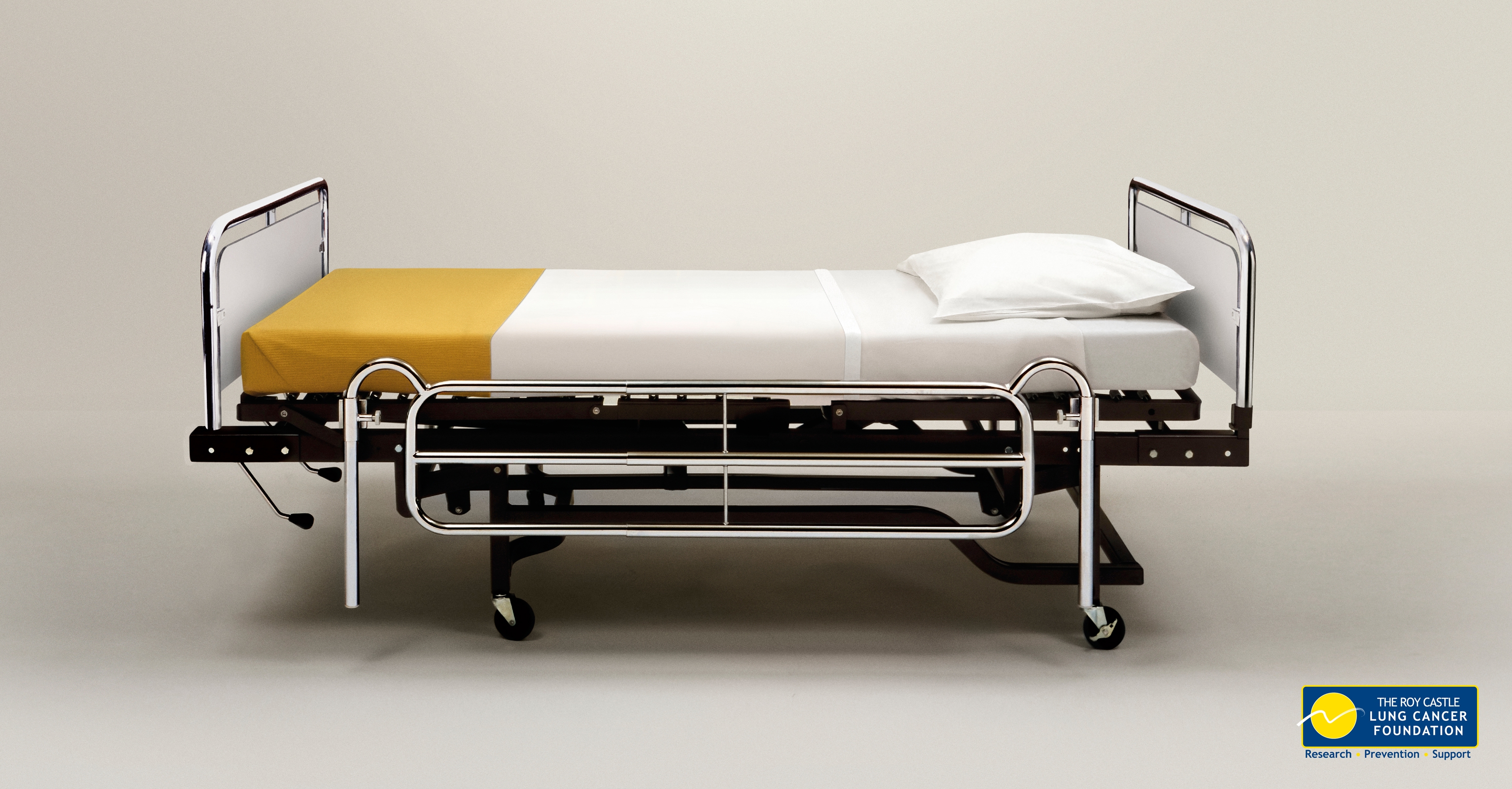
A simple hospital bed, bordered by nothing but negative space is the entity of this advertisement for the Lung Cancer Foundation. The shiny silver bed is made up with white sheets and a humble golden blanket at the bottom. Underneath the bed is dark and lacking in detail. The backdrop for the image is off-white and very plain, drawing all attention to the bed.
When I first glanced at this ad, it was clear that it was depicting something uncomfortable. The solitude of the bed, surrounded by nothing, is unwelcoming. The fact the image is almost barren makes the association between smoking and the hospital jump out. Perhaps filling the frame with a side table, rung, window etc would create a welcoming environment, changing the message. With a second look, I saw that that the bed is made to look like a cigarette; golden tip and white stick. The critical perspective being that the viewer has previously seen a cigarette and can make that association. This realization provided an understanding for why the image seems plain and color choice almost boring. The background is dull and off-white in color. The dingy feeling the background exudes makes the colors representing a cigarette more effect. Had the background been crisp white, the sheets would blend in and the image would lose its effect. Once your mind has settled upon the simple depiction of the hospital bed, already clueing in to the theme behind the image, your eye is directed at the Lung Cancer Foundation logo in the lower right hand corner. Although this sign is not needed, it minimizes opportunity for the image to be misread.
Historically speaking, this ad seems very different from the typical Lung Cancer or non-smoking advertisement. Although the message is still negative, it is not threatening or complex. The simple way about it makes it solemn and sad, but not aggressive. Some other ads examined stated: “One thousand Americans stop smoking every day - by dying,” “If we see you smoking we will assume you are on fire and take appropriate action,” or “If you must smoke, take your butt outside.” Compared to these, this simple ad and publicity approach seems rather harmless and maybe even more effective.
According to the ethical approaches defined in Lester, 2006 the symbolic meaning behind this image, being that smoking kills, is a Utilitarianism style. The basic message relays the “greatest good for the greatest number of people.” This is partially cultural as well. The Canadian Lung Cancer Association states “Tobacco kills about 45,000 Canadians a year. That's more than the total number of deaths from AIDS, car accidents, suicide, murder, fires and accidental poisonings combined.” This suggests that smoking is common in our culture. This ad is directed at the greater population, warning them of the dangers and the most common result of smoking: sickness and/or death. Furthermore, this ad suggests something about even people who do not smoke. Smoking doesn’t only affect those putting the cigarette to their lips, but also anyone in their surroundings that might also inhale the smoke. The hospital bed in the ad looks new, untouched and clean. This might be symbolic of those who do not sicken their bodies by smoking, but who may still be affected. Even though their lifestyle may be smoke free, their bodies may not be. Thus, the relationship between the shiny, new bed and the association of the bed belonging in a hospital.
The image is simple and the message clear; smoking is not good for your health. The empty bed suggests that it is waiting for someone to occupy it, maybe because it has just been rid of its previous tenant. The colors are effective and the composition precise. This advertisement, having only seconds to be interpreted, rings its point loud and clear. If I were a smoker, this would send chills down through my body and make me think twice before I put another cigarette to my mouth.